10px=1remとBootstrap4.3(Responsive font sizes)
10px=1remとする場合の
Bootstrap4.3『Responsive font sizes』機能を有効にして使う時の覚え書き。
10px=1rem とするには、まずhtmlフォントサイズを62.5%と書くわけですが、レスポンシブフォントサイズ機能を使う場合、これはかなりマズイ・・ということで、おかしくならないようにしたい。
https://getbootstrap.com/docs/4.3/getting-started/theming/
Bootstrapのテーマやコンポーネントのカスタマイズはsass変数を使用。
☆ファイル構造は
https://getbootstrap.com/docs/4.3/getting-started/theming/#file-structure
☆bootstrapをインポートする方法
https://getbootstrap.com/docs/4.3/getting-started/theming/#importing
custom.scssを用意するか(ファイル名はcustomである必要はない)、
bootstrapのsassファイルのうち必要なファイルのみをインポートする。
※オススメは、必要なファイルのみインポート。
※bootstrapのコアファイルはなるべく弄らない。
たとえば、
@import “../node_modules/bootstrap/scss/reboot”;
↓
@import “reboot”;
インポート先のパスを変更したりも可能なので、自分が把握しやすい方法で書けばよいかと。
_reboot.scss(scss/ _reboot.scss)
html {
  font-size: 62.5%; // 追加 10px=1rem
}
_variables.scss(scss/ _variables.scss)
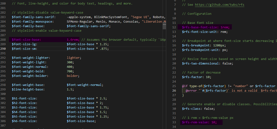
$font-size-base: 1.6rem; // 書き換え
_rfs.scss(scss/vendor/ _rfs.scss)
$rfs-base-font-size: 1rem; // 書き換え
$rfs-rem-value: 10;  //書き換え